


Duke University · CrUX (OIT)
Pathways: My Learning Redesign
Improving clarity and consistency in Duke’s co-curricular learning platform
Project type
Website Redesign
Timeline
Summer 2024 (12 weeks)
Role
Product Designer
What is Pathways?
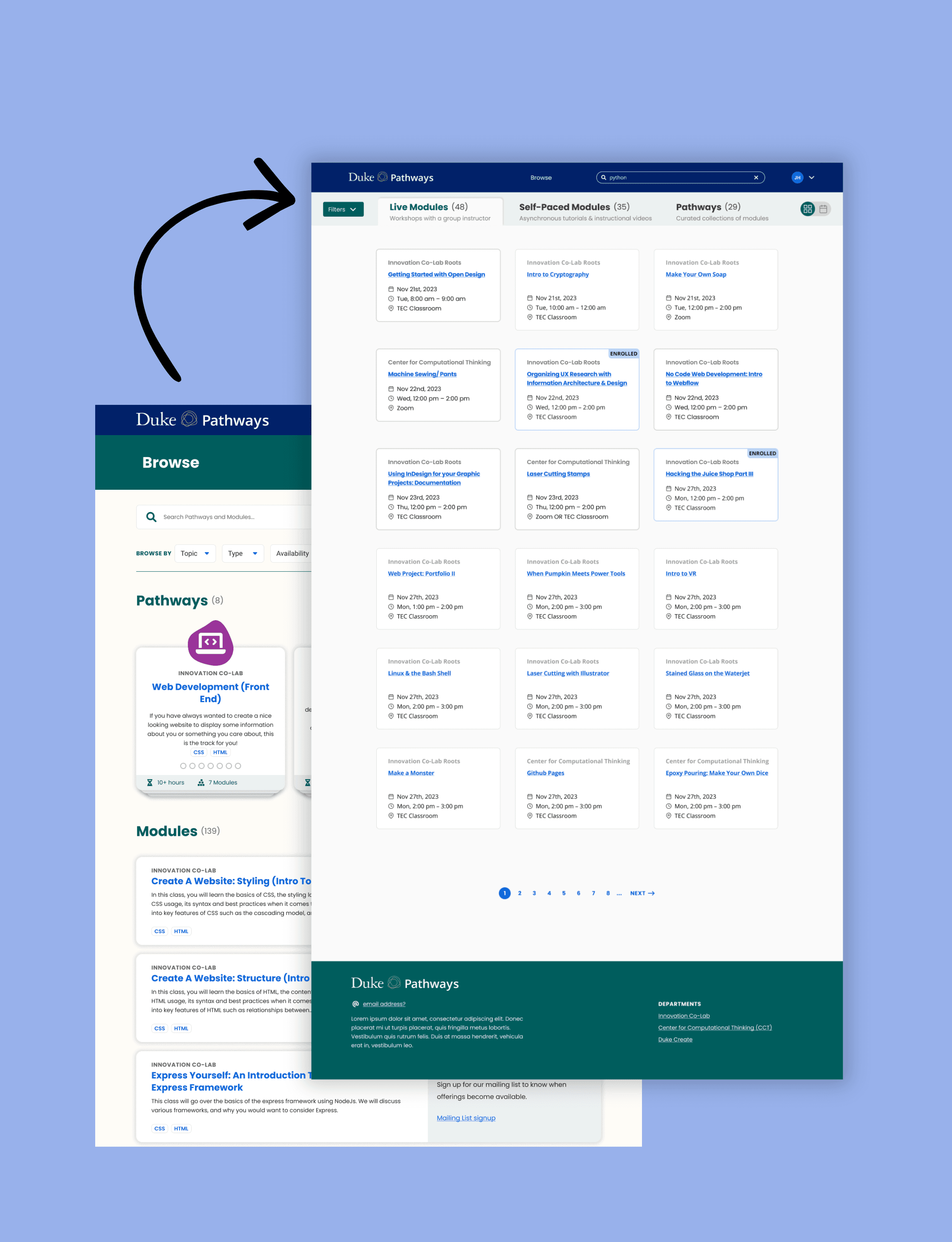
Pathways is Duke’s co-curricular learning platform, similar to Coursera. Students use it to join in-person workshops across a wide range of topics, from computer programming to soap making, and to complete self-paced modules.
While other areas of Pathways had recently been redesigned, "My Learning" still reflected older design patterns.
The goal of this project was to align "My Learning" with the rest of the product while improving clarity, organization, and consistency so it better supported how students actually use Pathways.
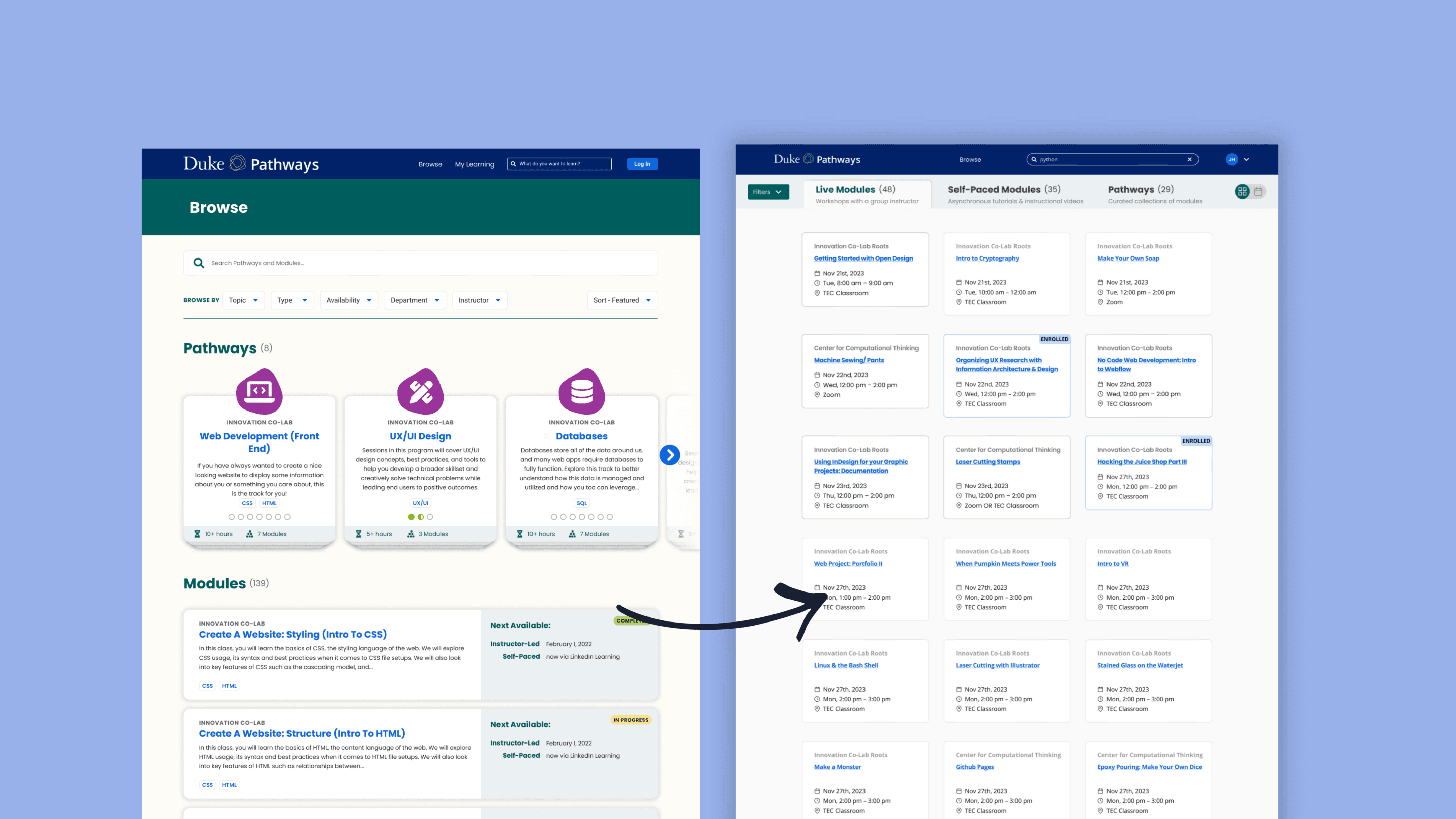
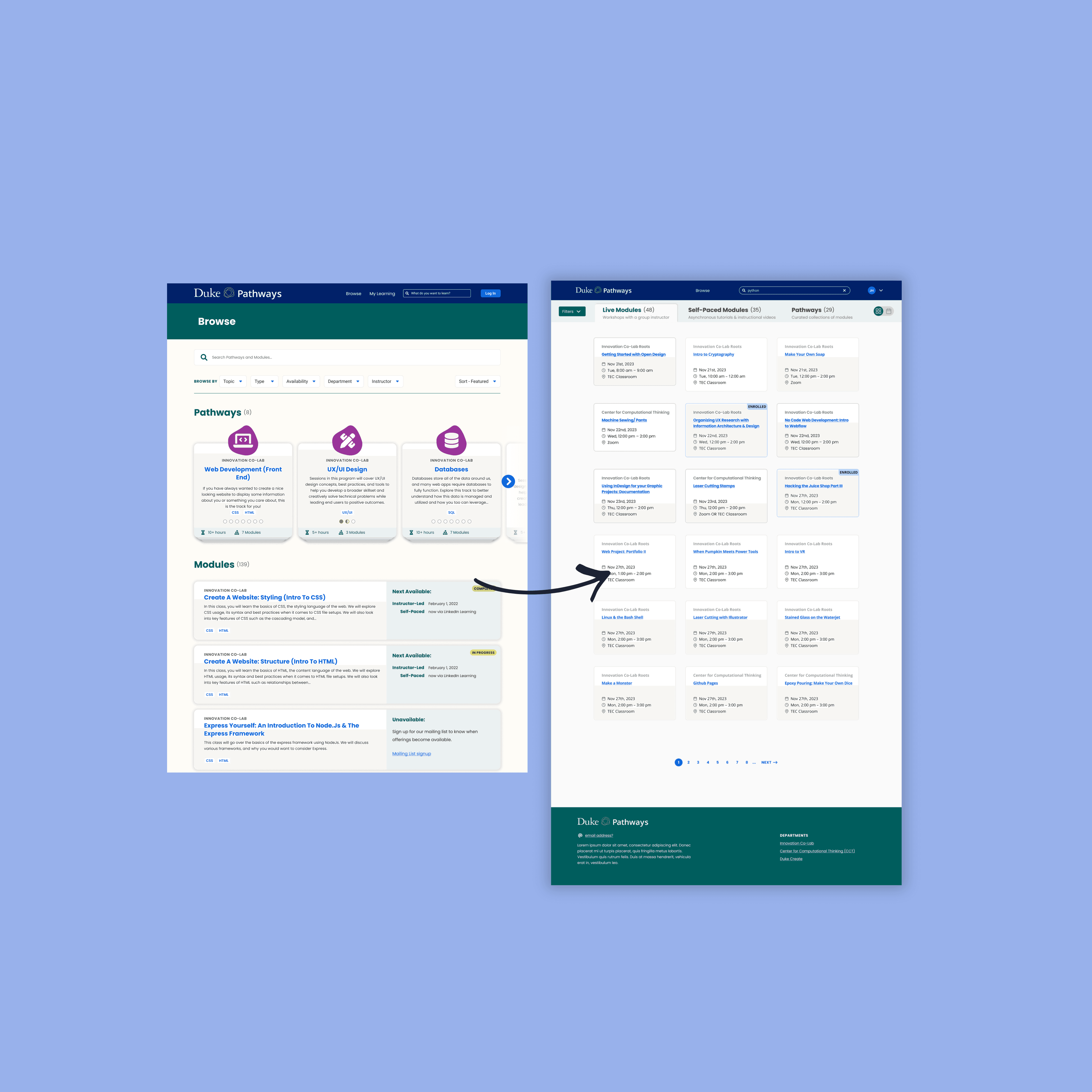
A core page that didn’t scale with usage
A core page that was visually outdated and harder to use than it needed to be
"My Learning" is where students track the classes and courses they’ve enrolled in, but the experience had several issues tied to both usability and visual consistency:
Dense layouts made it difficult to scan
There was no clear distinction between enrolled, in-progress, and completed learning
Older design patterns made the page feel disconnected from the rest of Pathways
Progress and status were present, but not surfaced in a way that helped students quickly understand where they were or what to do next
While the page worked functionally, it didn’t reflect the updated visual direction of Pathways and missed opportunities to resolve common usability friction at the same time.
This project focused on aligning "My Learning" with the updated branding, while also addressing clarity and organization issues in a way that naturally integrated into the existing product.
Understanding usage patterns and aligning with the broader system
I started by reviewing the existing My Learning page and auditing newer Pathways screens to understand how the product had evolved elsewhere.
To inform structure and hierarchy, I also looked at how other learning platforms like Coursera organize enrolled content, progress, and status. This helped ground decisions in patterns students already recognize, while adapting them to Pathways’ needs.
My focus throughout the process was on:
What information students need immediately versus what can be secondary
How learning status should be communicated visually
How the page should scale as students enroll in more content
Aligning layout, spacing, and components with the updated Pathways design system
I iterated from low-fidelity structure to higher-fidelity designs, refining hierarchy and layout with readability and consistency as the primary drivers.
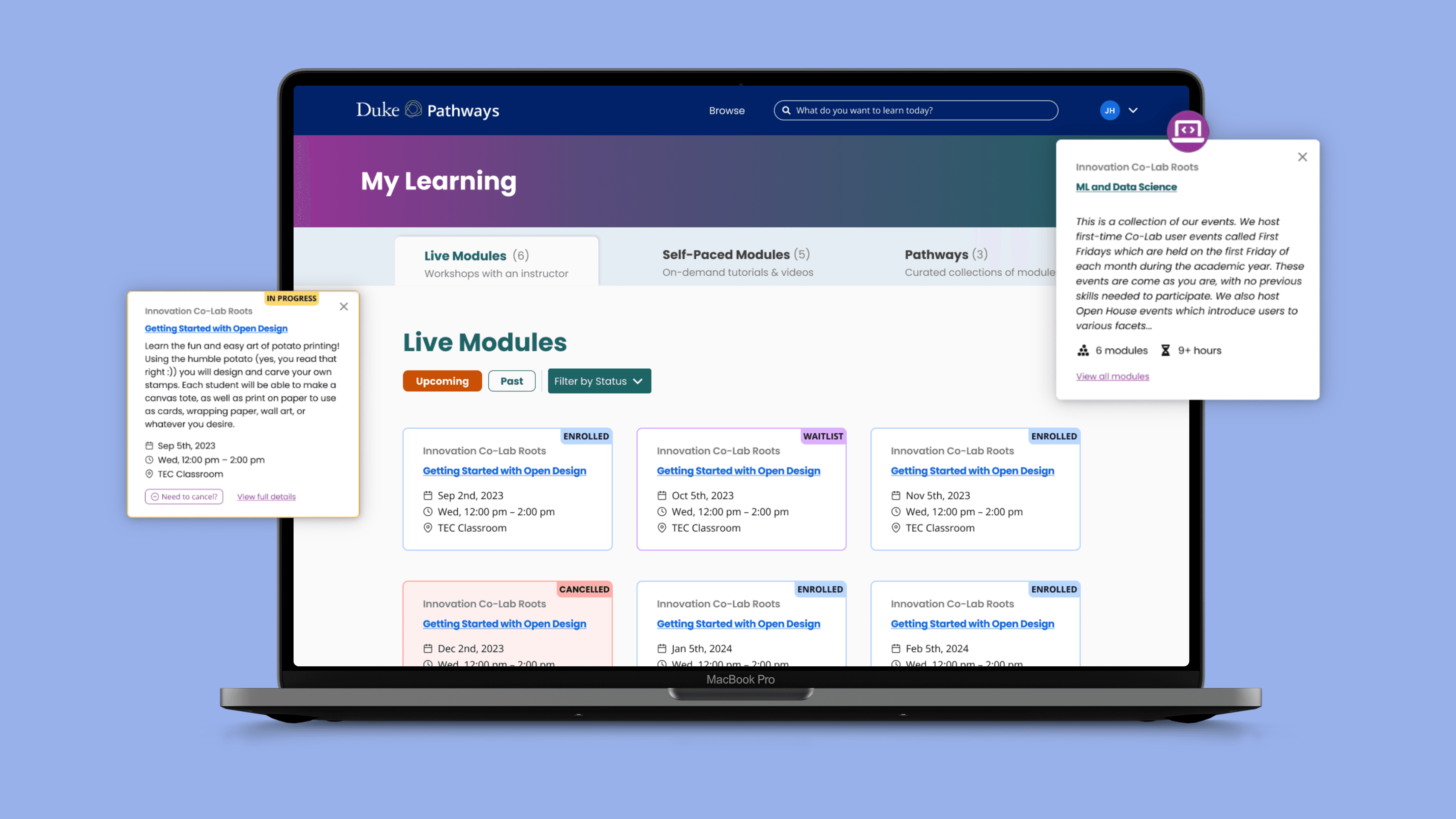
A clearer, more consistent My Learning experience
I redesigned the My Learning page to be easier to understand at a glance, while bringing it in line with the rest of Pathways.
Key changes included:
Clearer grouping of enrolled, in-progress, and completed learning
Improved visual hierarchy to surface status, progress, and next steps more clearly
Consistent components and layout, aligned with updated Pathways screens
Reduced visual noise, making the page easier to scan as content grows
While this project focused on design rather than direct metrics, the redesign helped:
Lower cognitive load when reviewing learning progress
Create a more cohesive experience across Pathways
Establish a stronger foundation for future learning-related features
Designing for clarity and scale
This project reinforced how important clarity is in student-facing tools, especially when a page needs to scale over time.
I learned how small decisions around hierarchy, spacing, and grouping can significantly affect usability, even when the underlying data stays the same. Working within an existing platform also pushed me to think carefully about consistency, reuse, and how individual screens fit into a larger system.
It was a reminder that impactful redesigns don’t always require new features. Sometimes the most meaningful improvements come from making existing information easier to understand and easier to use.