
Duke University · CrUX (OIT)
DukeMobile Library Services
Designing a native room-booking experience
Project type
Mobile App
Timeline
Fall 2025
Role
Product Designer (Sole Designer)
Bringing library room booking into DukeMobile
Over the past two years, I've worked part-time on Duke’s CrUX team (Creative User Experience & Accessibility Practice), contributing to audits and feature improvements across several projects, including DukeMobile. This case study focuses on one project within that broader collaboration: redesigning Library Services and creating a native room-booking experience.
Previously, library room booking lived only on the web. My goal was to bring this workflow into DukeMobile in a way that felt intuitive, fast, and consistent with the rest of the app, while working within technical constraints imposed by the existing library booking system.
I was the sole product designer on this project and worked closely with engineers to translate a complex, web-based flow into a clear mobile experience.
A critical student workflow lived outside the app
One of the most consistent pieces of feedback about DukeMobile was that students dislike embedded web links. When a feature simply redirected to a website, students found the experience frustrating and disjointed. Many preferred to skip DukeMobile altogether and go straight to the browser rather than navigate through an in-app link.
Library Services was a clear example of this problem. Room booking lived entirely on the library website, and the existing interface was dense, dated, and overwhelming on mobile. Despite being a high-frequency student workflow, it felt disconnected from the rest of the app.
As part of addressing this pain point, the goal was to bring Library Services into DukeMobile as a native experience, while also improving usability. However, there were important constraints:
Library Services is owned by a separate team, and changes to the underlying system were out of scope.
The DukeMobile team needed to work with the existing LibCal API, not redesign it.
Any solution had to be easy to maintain and resilient to future changes in the database or API.
This meant the challenge wasn’t reinventing the system, but translating an existing, web-first workflow into a mobile-first experience that felt intuitive, reduced redundancy, and fit naturally within DukeMobile, while remaining flexible enough to adapt as the underlying data evolved.
Designing for failure, not best-case scenarios
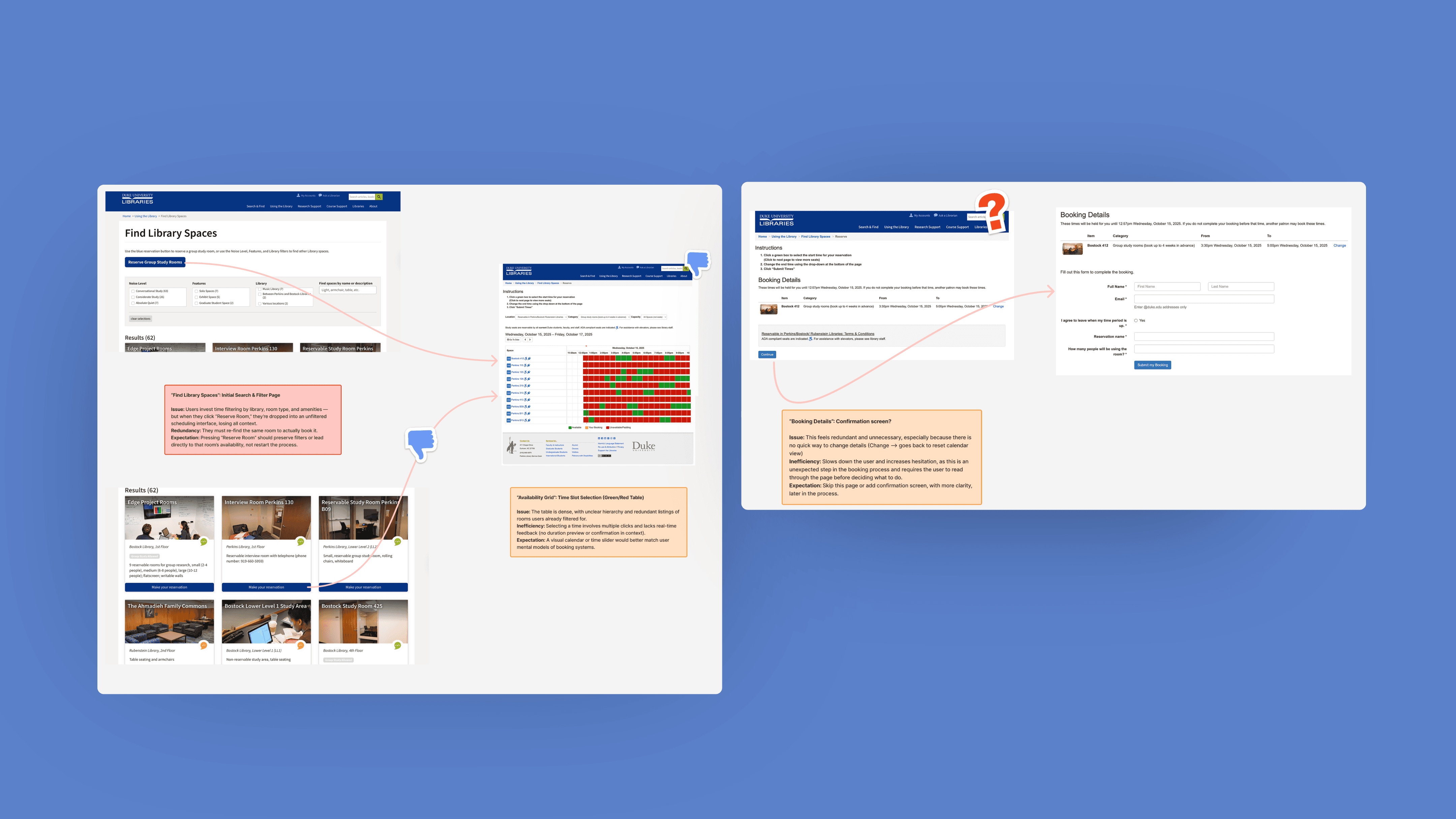
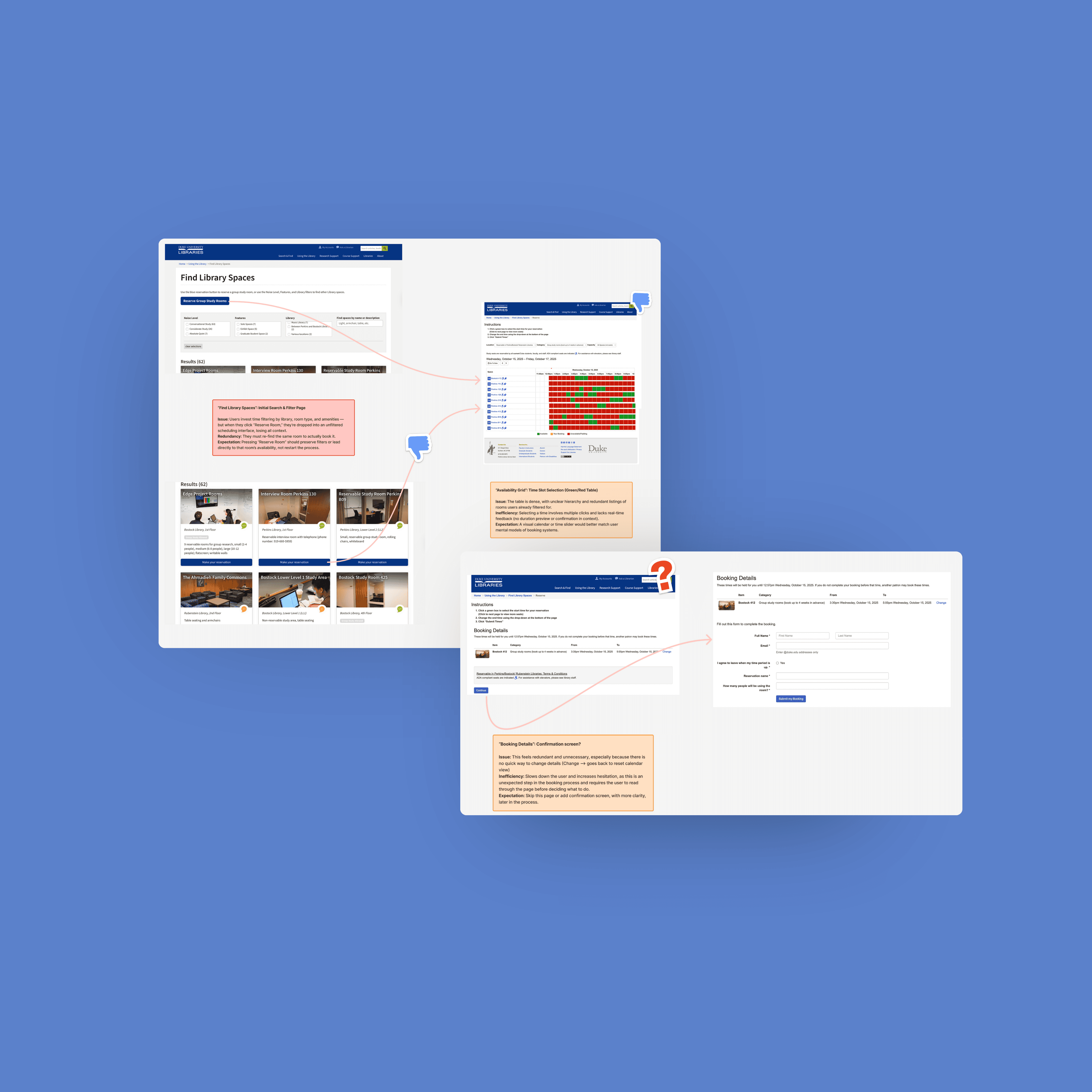
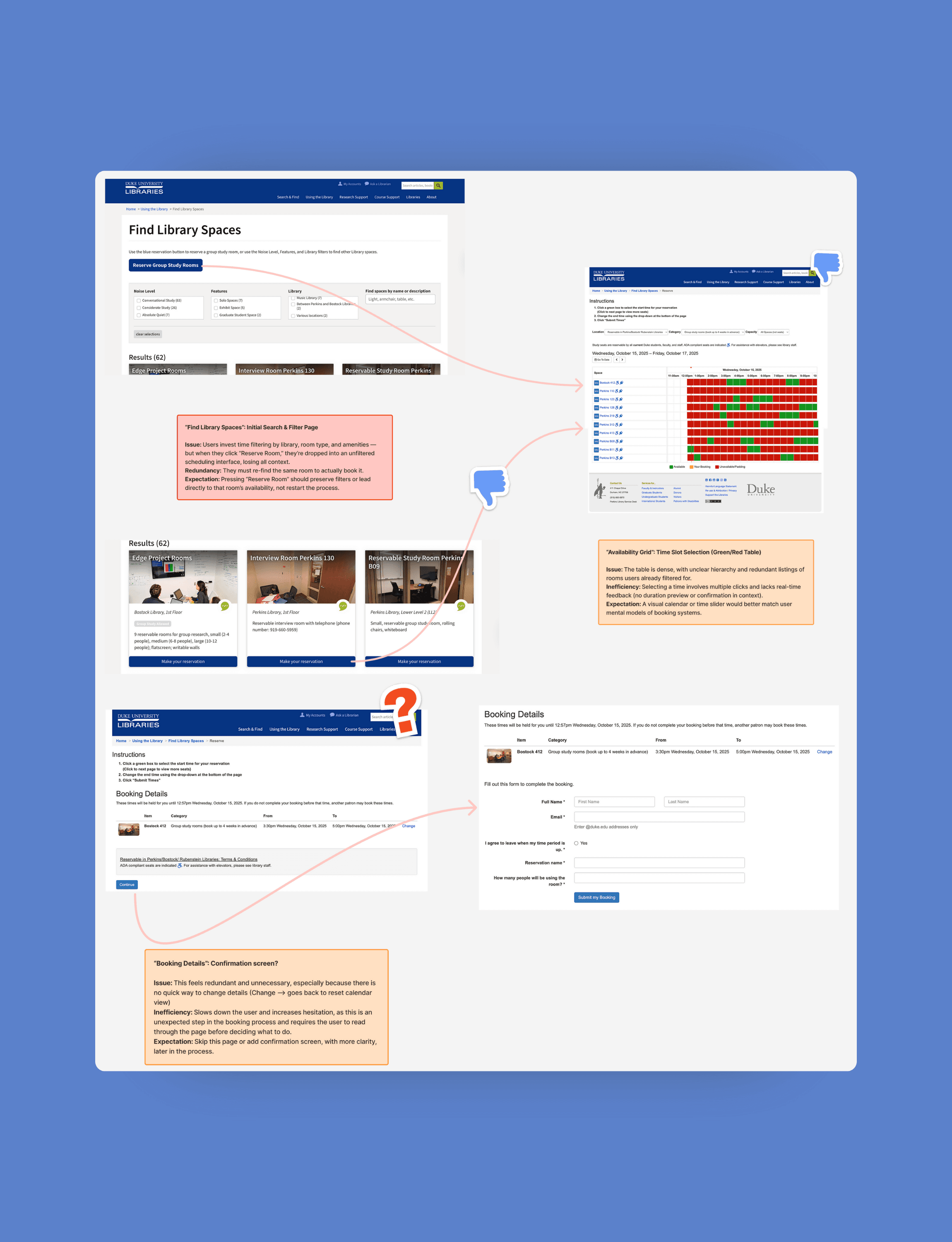
I started by reviewing the existing DukeMobile screens and the full library room booking flow on the web to understand how the experience worked across devices.
The current library interface shows all availability at once, using green for bookable time and red for conflicts. Not only is this an accessibility concern, it surfaces too much information at the same time, making it hard to quickly understand whether a room works for a specific time or duration.
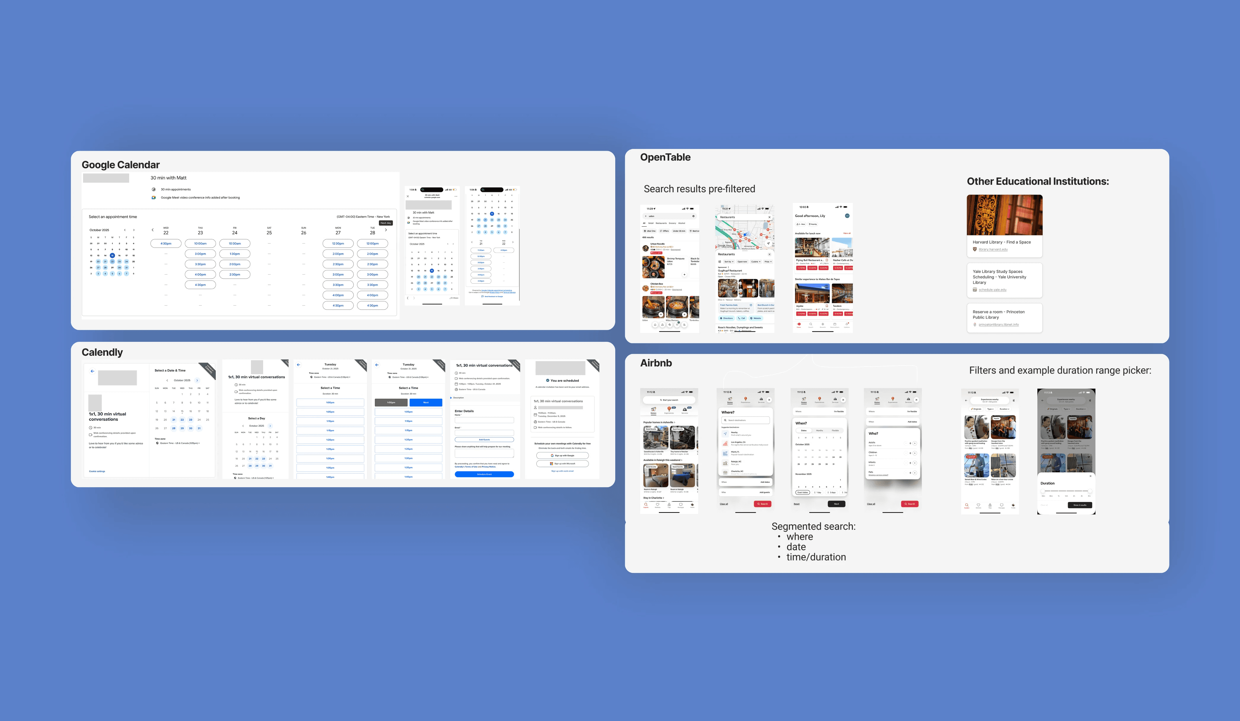
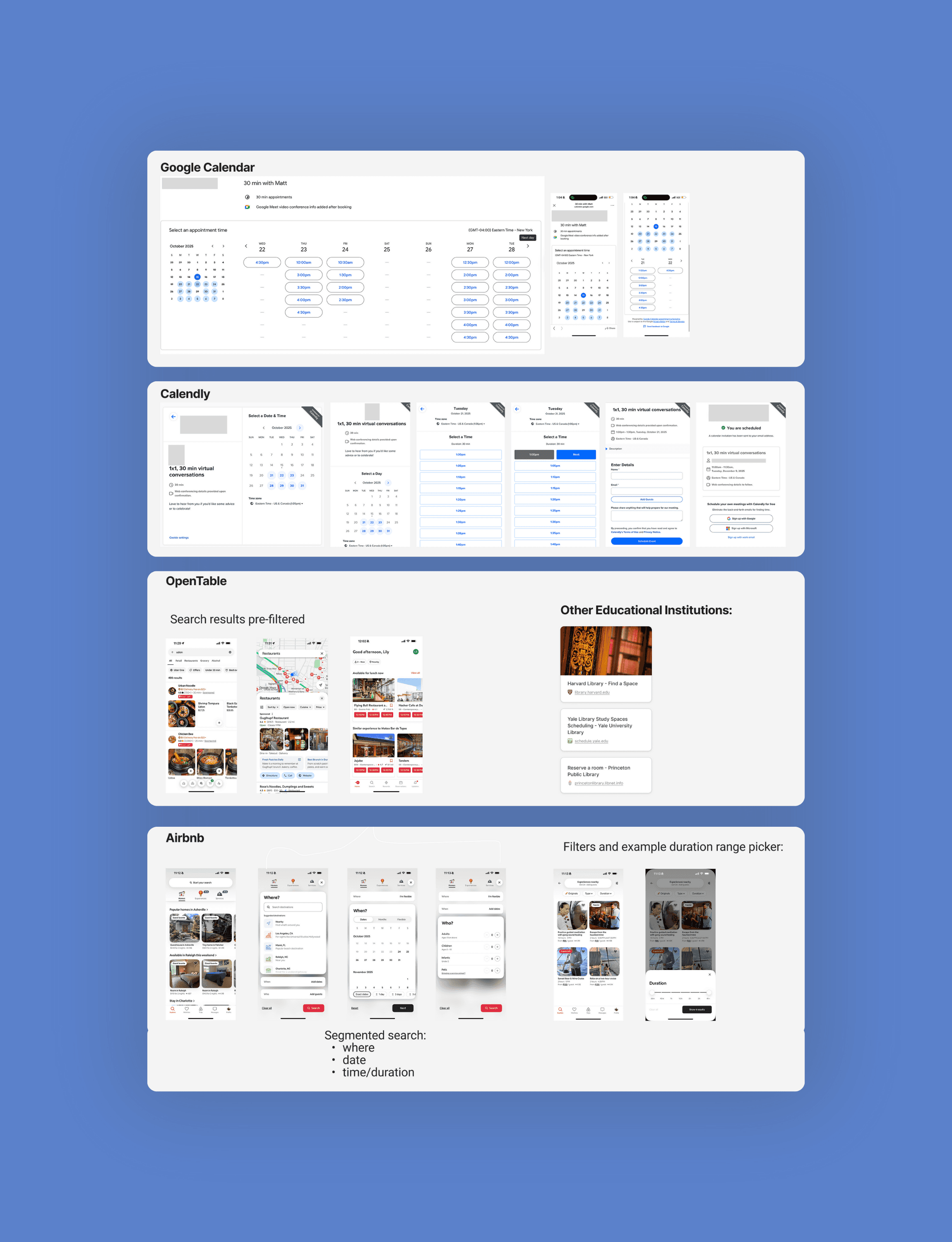
To ground my design decisions, I reviewed common scheduling patterns in tools students already use, such as Google Calendar, Calendly, OpenTable, and Airbnb. Most of these tools simplify availability by working with fixed or standardized time frames.
That said, library room booking is different because students define their own start and end times, and availability depends on both when and for how long they want the room. Because of this, those patterns were more useful for shaping interaction details, like filters and confirmation flows, than for structuring how availability itself should be surfaced.
On the technical side, the LibCal API structures availability around locations, not time-based search. Because of this:
Searching purely by time wasn’t feasible
Rooms shouldn’t appear multiple times for different time slots
Time needed to be adjustable within the flow, not the primary driver
Taken together, these constraints and patterns pushed me toward an approach that emphasized clarity early, flexibility around time, and a flow that respected both the system and the way students actually book rooms.
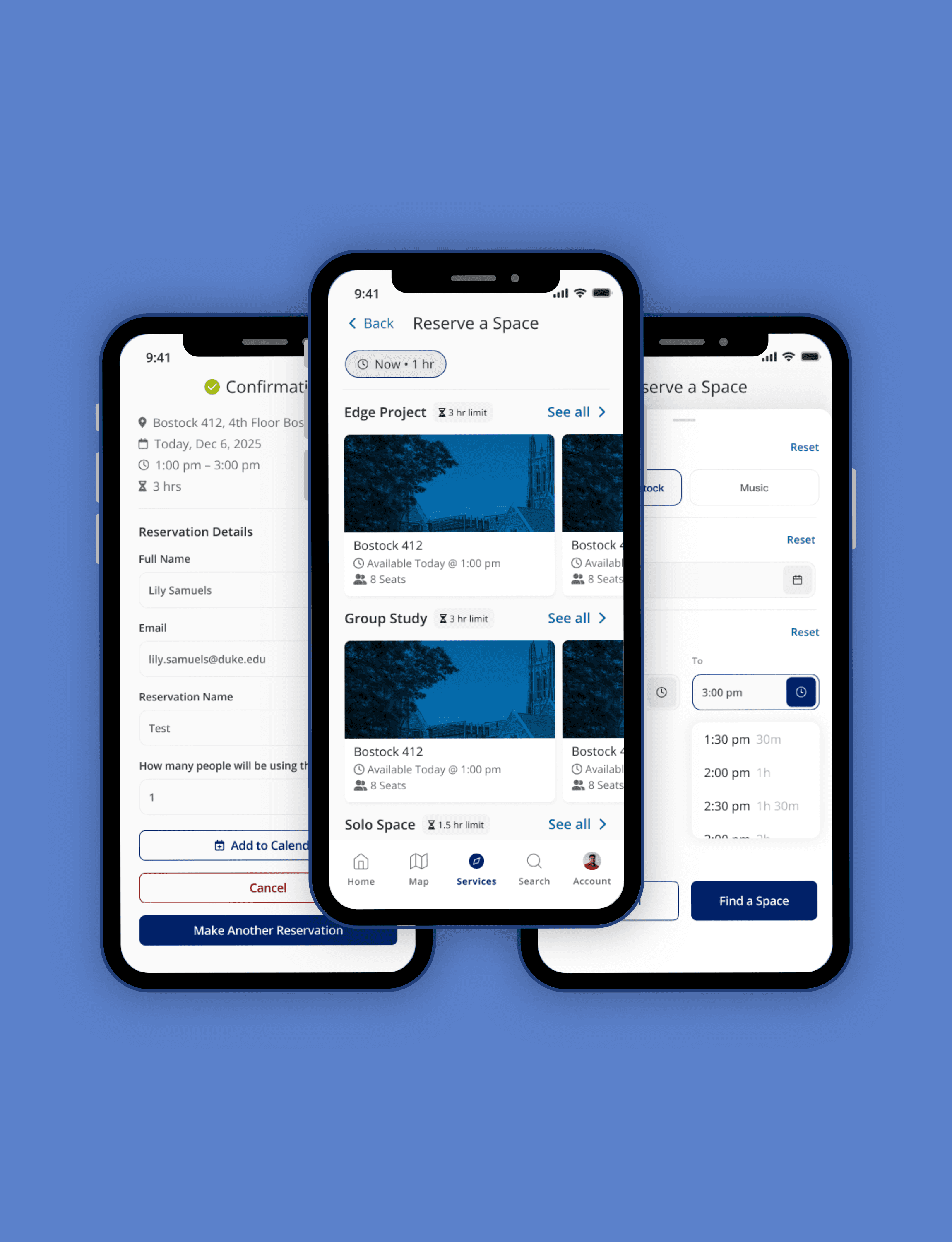
A mobile web app that bypasses failure points
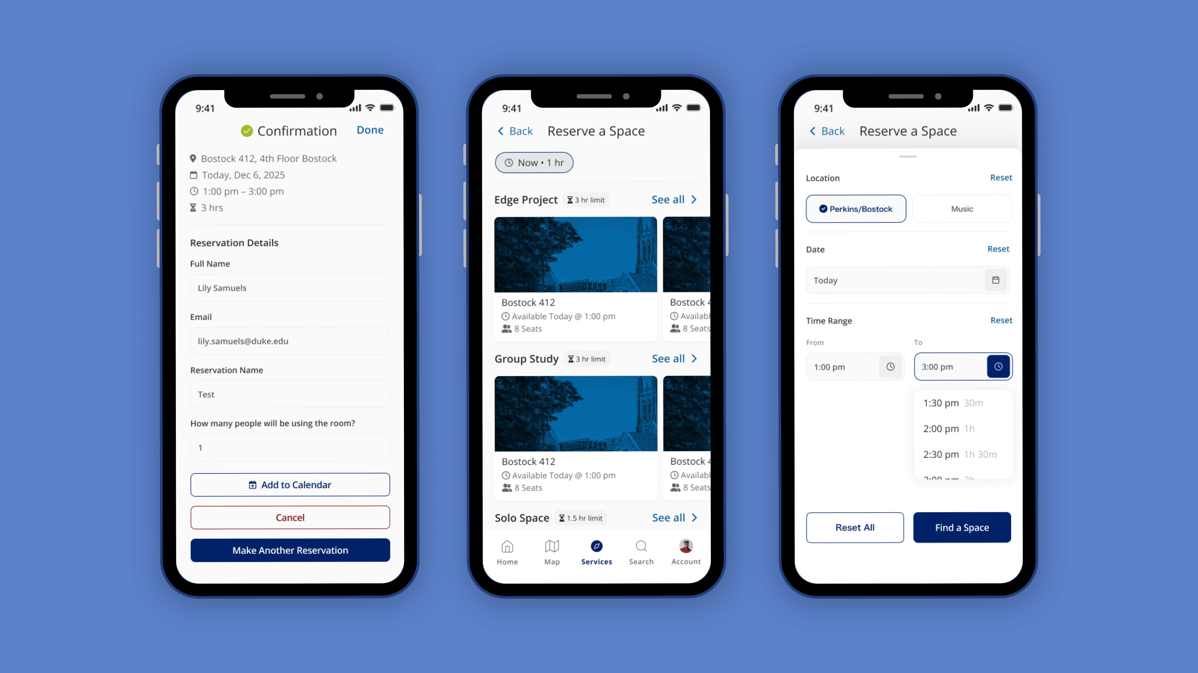
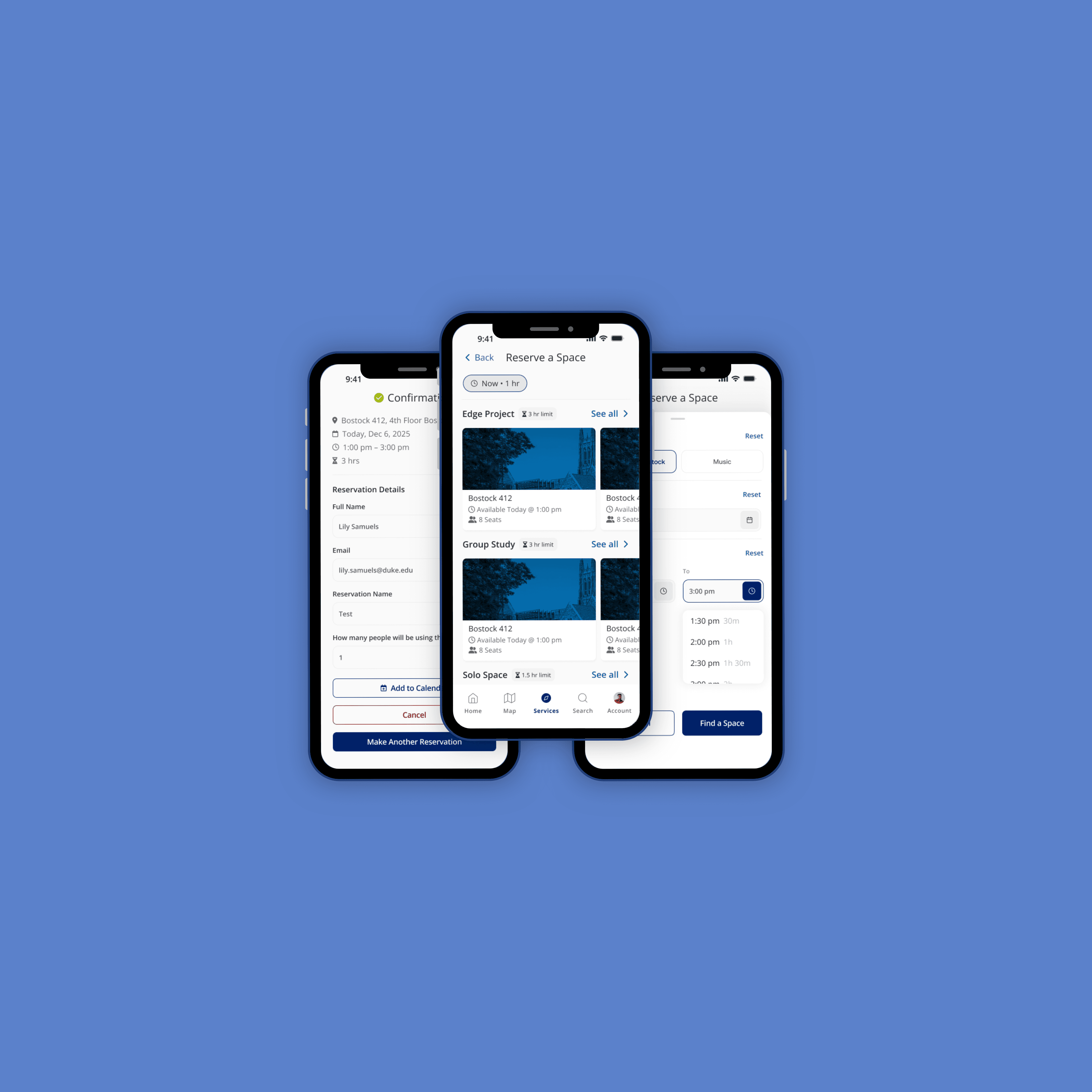
I designed a location-first, mobile-native booking experience that works within LibCal’s constraints while making availability clearer earlier in the flow.
The experience focuses on helping students quickly answer a simple question: Is this room bookable for my time?
Key elements of the solution:
Rooms are filtered upfront by location and selected time, so users only see spaces that are actually viable
Room-specific duration limits are surfaced early, preventing late-stage dead ends
Time can be edited at any point, allowing users to adjust without restarting the flow
By structuring the flow this way, the interface stays clear and approachable while still supporting flexible, time-based booking.
This project's impact can be measured through clear experience improvements:
Reduced cognitive load compared to the web-based flow
Earlier feedback on whether a room fits a user’s time and duration needs
Fewer dead ends late in the booking process
Improved accessibility by moving away from color-heavy availability displays
A reusable pattern for bringing web-only campus services into DukeMobile
More broadly, this work established a scalable approach for designing native features on top of existing systems, balancing user needs, technical constraints, and long-term maintainability.
Resilience is a design requirement
This project reinforced how much good design depends on understanding the systems underneath it. Working within the constraints of an existing API pushed me to think carefully about what was and wasn’t possible, and how to design an experience that felt intentional rather than limited.
I learned the importance of surfacing the right information early. Showing everything at once may feel thorough, but it often creates confusion. Designing for mobile required being selective about what to show upfront and what to reveal only when it’s useful.
This work also deepened my understanding of accessibility and data clarity. Relying on color alone to communicate availability can exclude users and make information harder to interpret. Thoughtful hierarchy and progressive disclosure proved to be more effective.
Finally, being the sole designer on this project strengthened my ability to balance user needs, technical constraints, and long-term maintainability. It helped me get more comfortable making tradeoffs and designing systems that can evolve without needing constant redesign.